

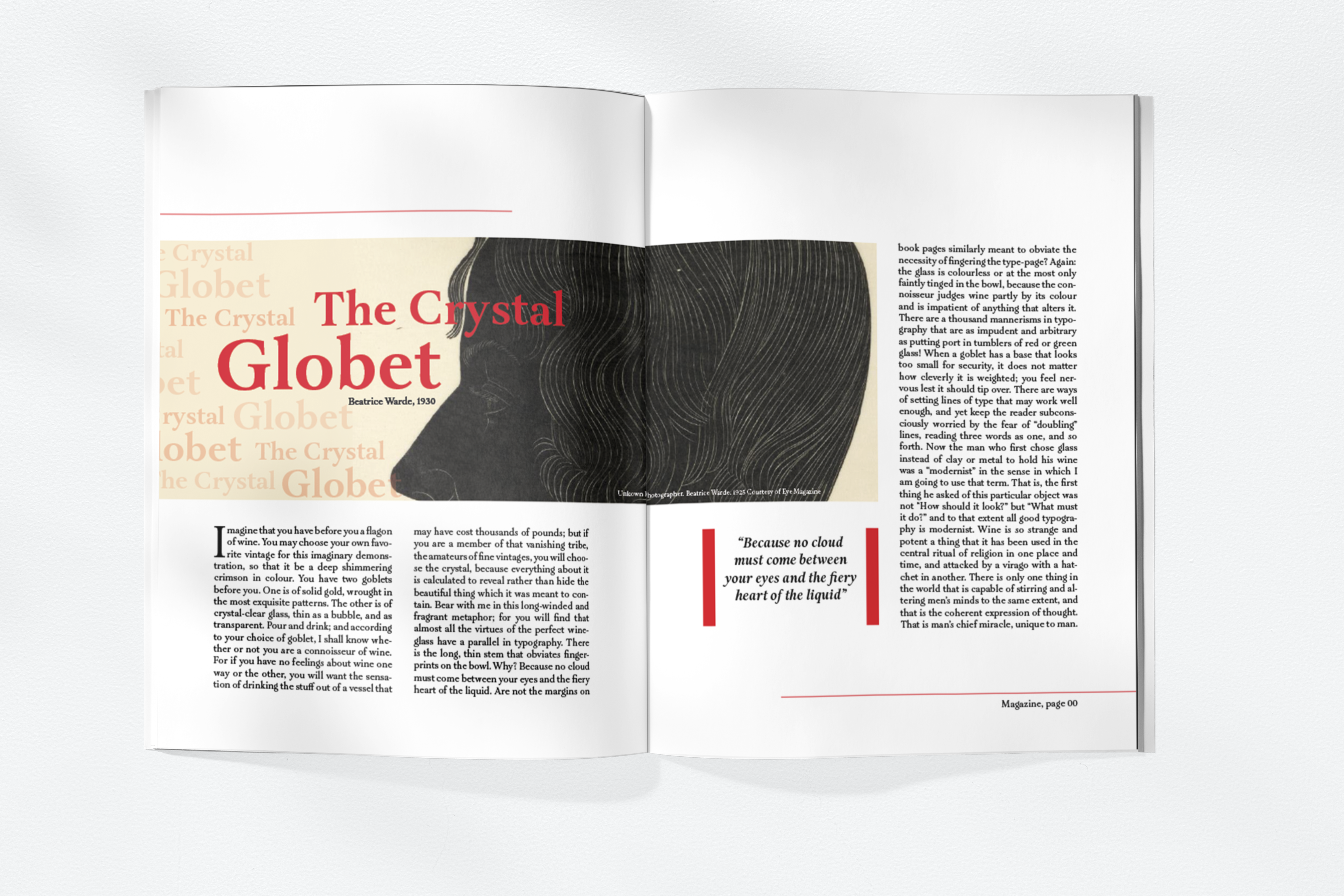
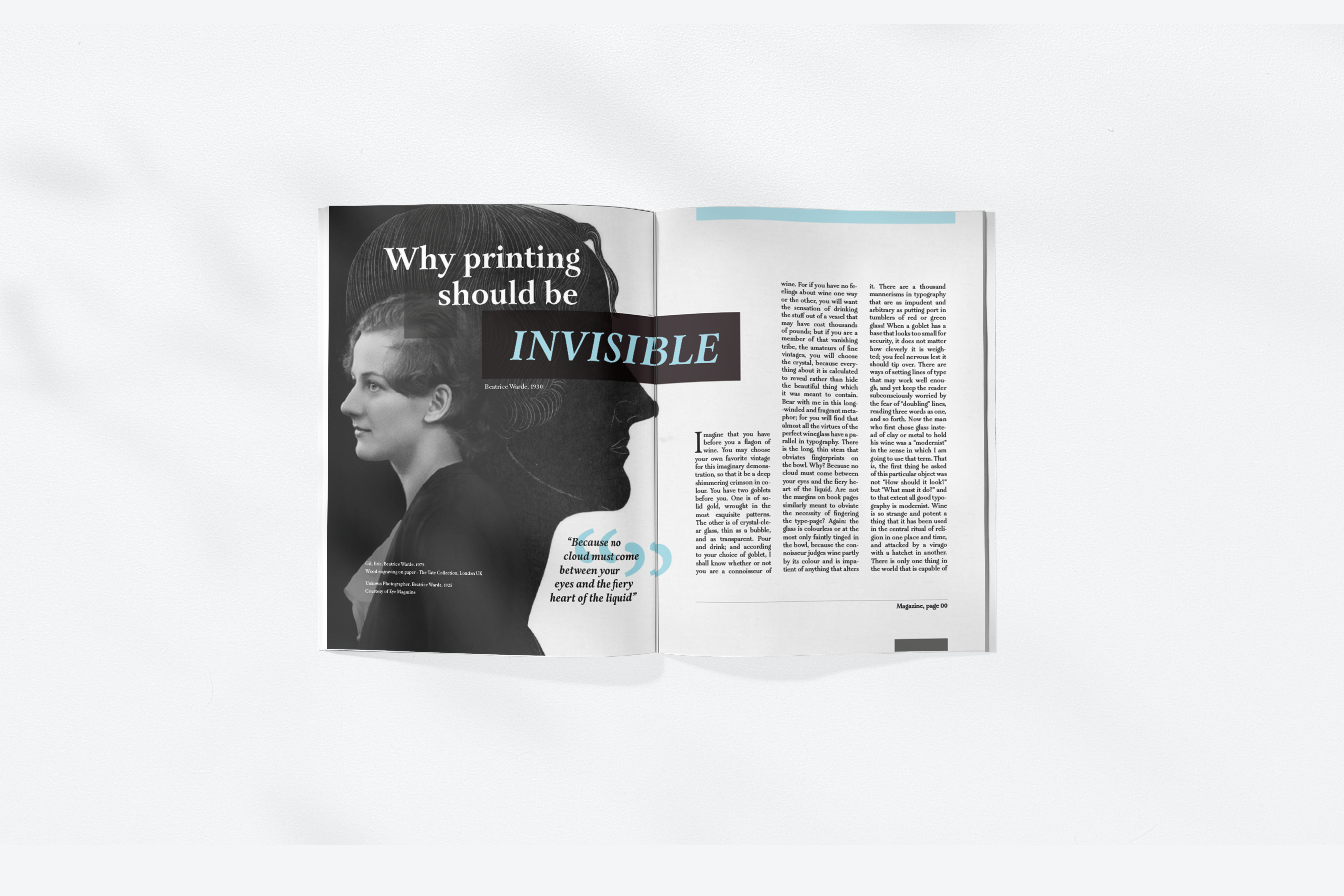
These two editorial pages emerged from exploring Beatrice Ward’s 1930 text, “The Crystal Goblet.” Created as part of an amazing Typography class, the assignment was all about the decision of whether the typeface in a material should be made visible or blend seamlessly into the design.
Designed without a predefined theme, these editorial pages enhance my skills in the technical intricacies of magazine layouts. The assignment prompted a meticulous consideration of typography elements, from type visibility to size, spacing, and overall aesthetic harmony.
Each spread unfolds as a visual narrative, playing with imagery, negative space, and impactful titles. The goal was not just readability but also an eye-catching, professional aesthetic that complemented the thought-provoking content with different colors and distinct visual experiences, but utilizing the same content.
